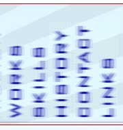
 I’m happy to say, I haven’t seen bona-fide mystery-meat navigation in years, but strangely, as I’ve been reviewing what other designers have been doing about their online portfolios, I’m finding it more and more. This example was so bad I just had to post it. Not only is the navigation device out of focus (making it hard to read), but it’s vertical. In other words, even after the ‘reveal’ (when you mouseover the mystery meat) the navigation is still hard to decode. Sheesh!

