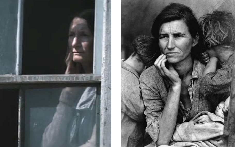
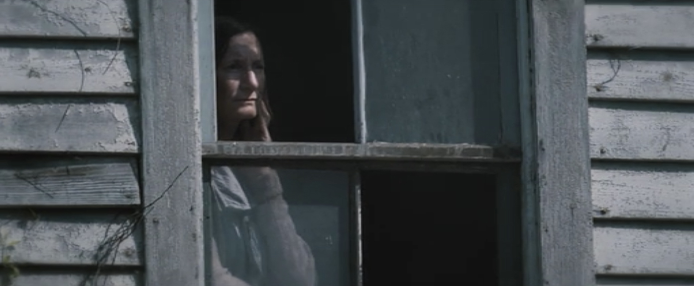
CU-1 demanded we watch “Catching Fire” just now and I was reminded of a thought I had while watching the first film in the Hunger Games series. The frame above is taken from “The Hunger Games” and happens rights at the start as we are introduced to the main character.
It’s a still life that lasts a couple of seconds and is part of a painful but beautiful scene-setting: soot-coated men walking back from the mines; children barefoot and dirty playing in the wasteland; an old toothless man fighting chicken bones are all images that describe the poverty and suffering of “District 12”, the lead’s homeland.
I remember thinking how wonderful this scene-setting was as it referenced historical touch-points that resonate.

This particular portrait made me think of Dorothea Lange’s “Migrant Mother” photographs taken for the Farm Security Administration in February 1936. I never actually compared the two at the time but after seeing Catching Fire I went back and compared the images. I just love the effort that went into getting that just right:-)
Powerful stuff, and the anger one feels at poverty and injustice is made all the more tangible by the art direction.

 What does an R1200GS Adventure look like with 4 wheels?