Building MT5 on iPad2
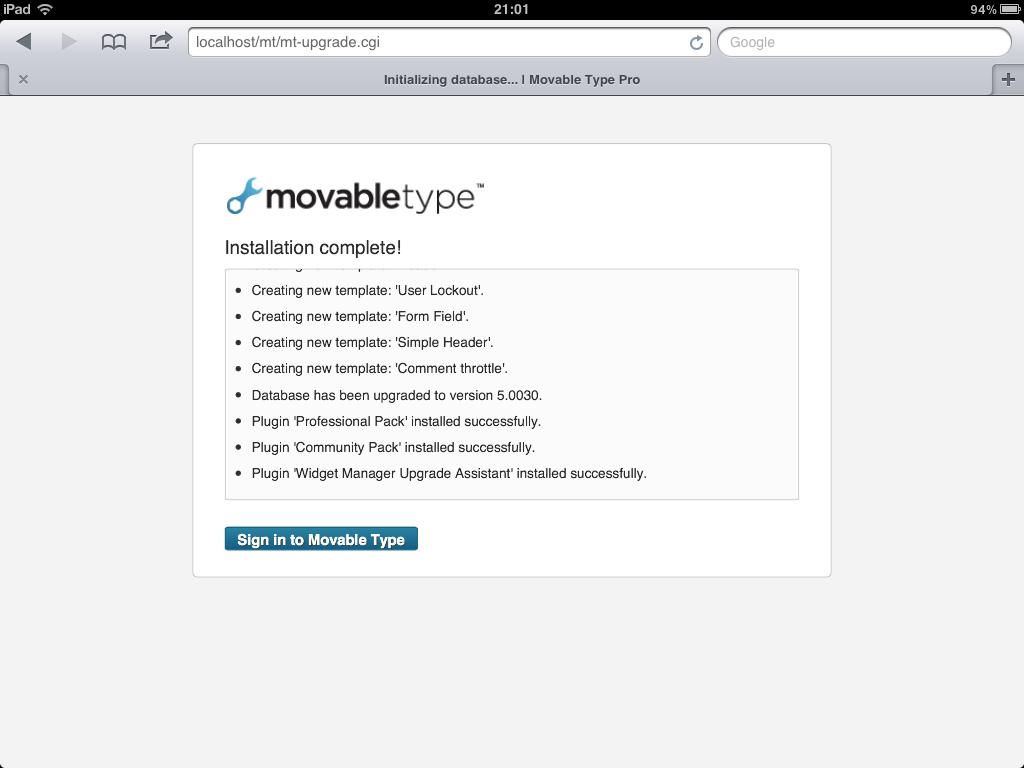
Well, I’ve been trying to get this to work for ages (yes, utterly pointless I know) but the screengrab below is from an iPad 2 running Movable Type 5. If you’ve built MT before you’ll know this is a happy screen:-)
(I originally posted this project in February 2012)
The box is built with lightty as the web server, sqlite as the driven database and Cydia Perl p5

So far the only thing I haven’t been able to work out is how to map “choose file” httpd post file uploads to the iPad “choose file from Air Sharing, Keynote etc.” so all the “choose file” functions don’t work. Not surprisingly there’s not a lot of Google-searchable content on the topic…
Will keep looking:-)
Metro UI, Sharepoint, iPad etc
As part of my thinking about tablet-based experiences, I’ve been playing with the Metro UI at work.
It’s a really interesting project whereby a design framework is influencing the culture of a major technology company and bringing the UI of its software products into a really interesting space. The Metro project is still relatively young but it is sufficiently mature for enterprise product and software people to begin thinking about how the framework might help them connect all their stuff.
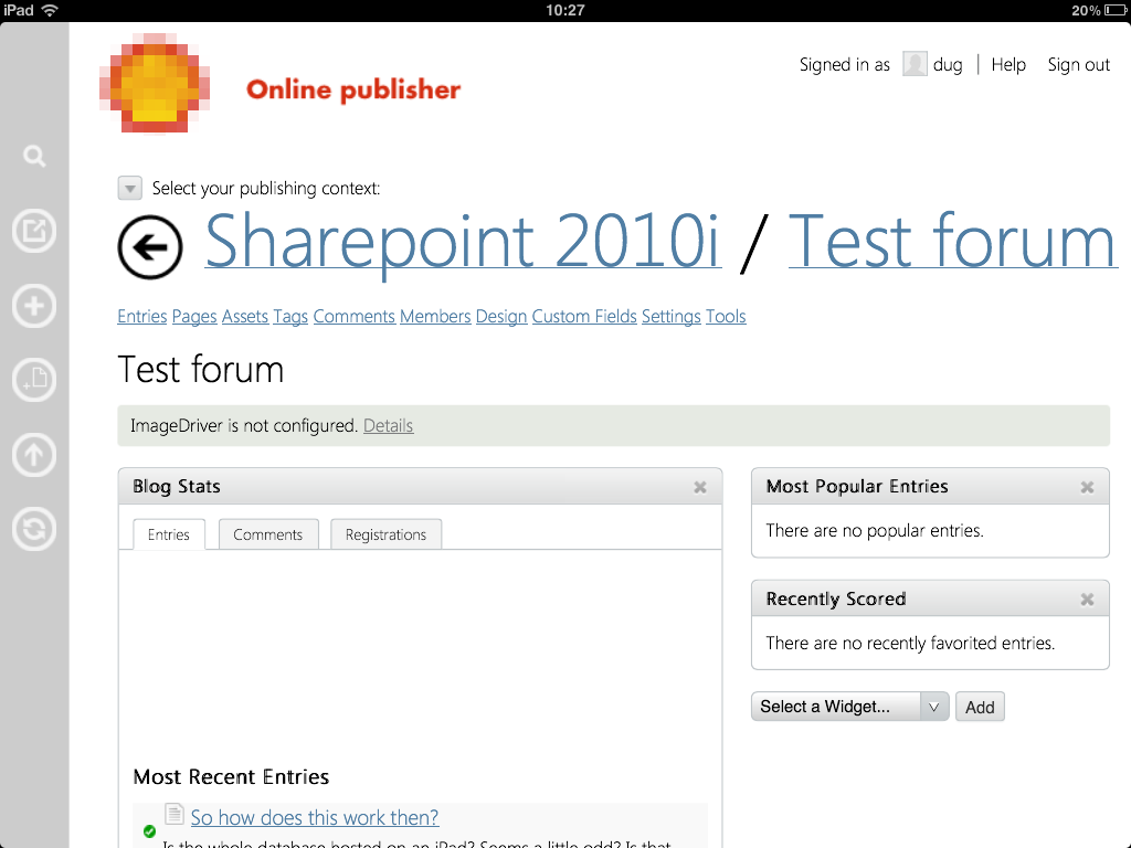
Over Easter I put a skin together as an experiment to show what a hypothetical enterprise Sharepoint web CMS installation might look like on iPad using the Metro visual language as a way to tie the different channel experiences together:

Sharepoint has many more features than Movable Type but there are enough cross-overs to make this experiment interesting. Here are the primary UI tweaks to date for any curious MT5 people out there:
- Break “scope” nav object into two separate components
- a drop-down list to set operating context and
- a large <h1> title to give you strong situational awareness (this last item feels like a big improvement on stock MT5 UI)
- Move “create new” menu items into a Metro-style “app bar” or “Charms bar” (haven’t decided which to go with yet). These are nice as they become contextual the bar icons update based on application context
- Move top-bar universal links (view site, search, rebuild) to this same app bar
- Kill left-hand-nav and reload as a horizontal-scroll experience across the top of the main editing area. This isn’t working yet but I’ve grabbed the jQuery from jqMetro which works well and looks great on the iPad
- Use the Metro “back” arrow to provide a universal hook back to the “user dashboard” - kind of a “hyperspace” button for when you get confused
- Serve the Segoe UI font in the CSS
One the the interesting user experience bits I’ve come across as I hacked the CMS templates was the behavior of the main left-hand-nav elements.
When I started pulling the 6A UI apart, one of my first worries was how was I going to handle the secondary nav items in the main left-hand-nav (things like “new”, “manage” etc). What I found was that almost all of these links were un-necessary and most functions were accessible by hitting the left-hand-nav primary items (“tags”, “comments”, “members” etc). I say almost because I did find a few dead-ends but most were covered by either the publishing context drop-down or in-page links.
Mostly still broken and lots still to do but a fun holiday project:-)
 The general election, 8 June 2017