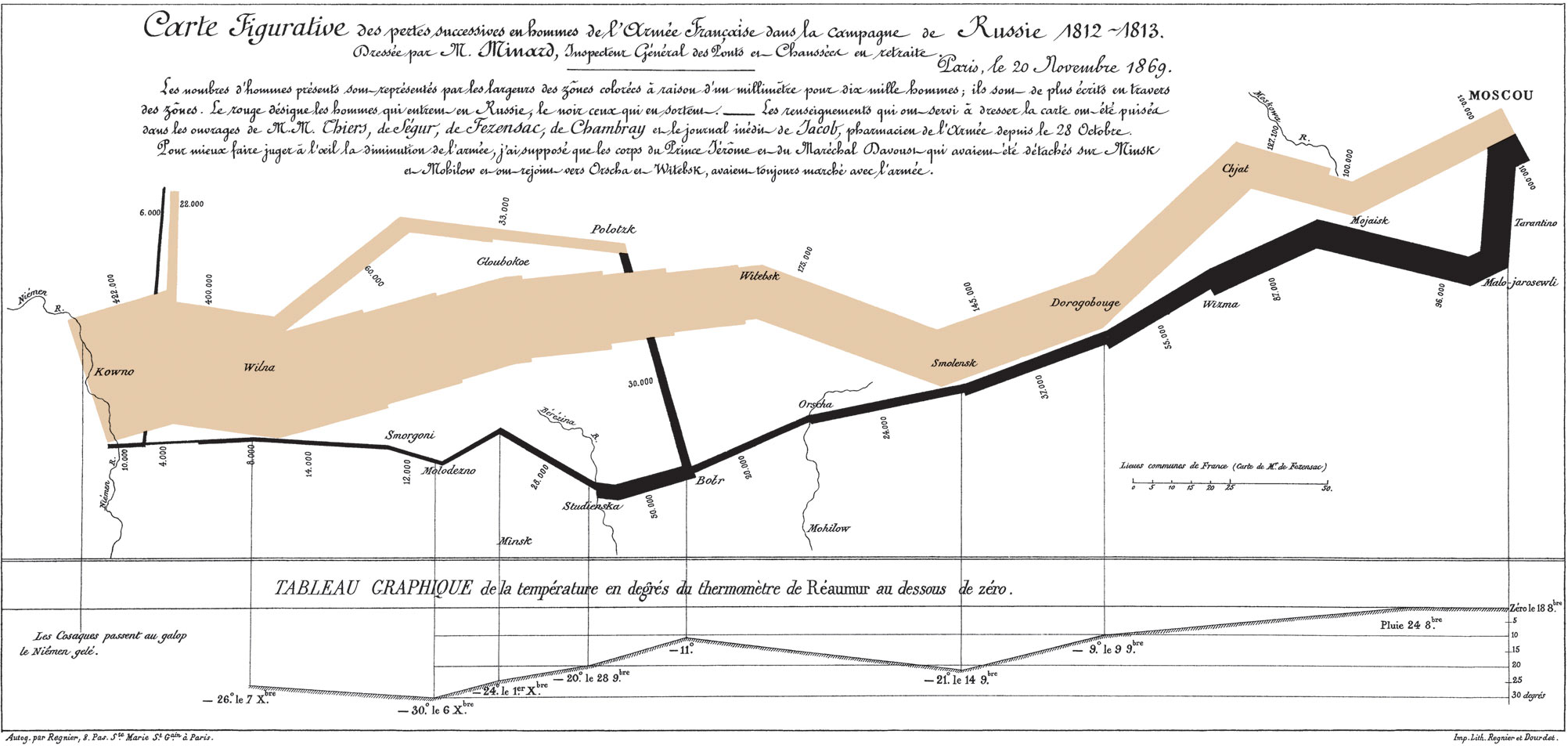
This infographic is taken from Ed Tufte’s ultra mega super duper important work The Visual Display of Quantitative Information and describes several different data ranges (geolocation, temperature, number of men) which combine to describe the terrible impact of Napoleon’s march on Moscow.
It strikes me as we think about baskets and delivery systems that if an engineer can pull something like this off in 1869 we should be able to do something similar:-)
As I was looking for the link above I came across this article in The Economist which show many other useful examples.
Interesting also that Tufte is working in the Obama administration. They’ve just migrated recovery.gov to the cloud (thinking about our own lack of dev/uat/staging/deploy server system) and a look at the site really speaks volumes about Tufte’s work on information display over the years.
 Bad Dug