
I closed my Zopa account yesterday and requested the paypal funds I had invested be returned to my Paypal account. The folk on the phone were helpful and courteous but I can’t help feeling a bit amazed by the experience (Zopa is supposed to be a great site, so perhaps my expectations were inflated).
I’m reluctant to pointlessly hurl vitriol at the company because on balance, while the experience ultimately sucked, there were some very good bits as well as bad to the service.
The good news:
- Brilliant idea, cuts out the middle-men
- UK-based telephone support
- Friendly staff
- Beautiful design
- Secure (https) email system
The bad:
- The risk-to-interest rate ratio
- An email support loop that didn’t resolve my difficulty</li>
- The interface experience
It’s this last problem that pushed this Zopa customer over the edge. It’s interesting to see how superficially minor problems in the user interface can have such a large impact.
The interface really is very beautiful, but it degrades quickly once you start clicking around. To be fair, I wasn’t able to explore the whole service, and in particular I never got to the ‘magic moment’ of actually lending or borrowing funds (I did try). But the journey I did manage was a rough one. The problems seem to arise from the site’s scripts.
Two items caused me to fail my tasks. The first is a javascript validator that prevented me from successfully choosing and saving my security details (this should be really easy to fix) and the second is a series of redirects and cookie-setting choices that mean I didn’t get feedback as to where I was in the lending process (I got as far as getting cash to lend into the system but never managed to set up a loan).
The Javascript thing makes an interesting example of how things can go wrong.
Here’s what happened (if you can’t read the text, click on the images for a larger version):
Step one–I tried to complete the logon form like this:
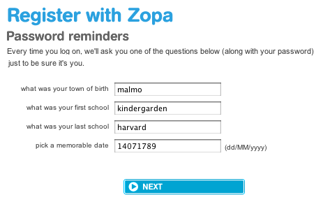
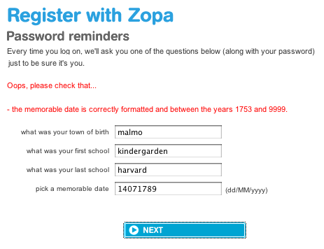
Which returned this screen:
Now I always assume I’ve done something wrong when a form comes back like this so I also tried this:

and this:

and this:

and even, after taking a long look at the “dd/MM/yyyy” prompt!?!:

All of these returned the message:
Oops, please check that the memorable date is correctly formatted and between the years 1753 and 9999
(I did finally get in by typing the numerical equivalent of asdfasdf which of course meant I couldn’t retype the date when later prompted for it)
Some possible solutions?
Option one, the bare minimum. Change the text of the error message so that it contains an imperative. It should read “do this and achieve that” not “this might be wrong”.

Option two, if the date range is so important (remember the original error that specified a range from 1753 to 9999) then don’t allow the user to input an out of range date. Give them a select statement which only contains valid years.

Option three, make the error message specific to what is wrong and suggest a correct alternative. Offer links to fix the problem.

Finally, as I was about to hang up from my last call with the nice folk in customer support, I was told that the system didn’t work in Firefox and that I needed to use Internet Explorer.
Yes… she actually, really, did say that…